Which Countries Are The Real Summer Olympic Winners?
The most traditional and by far the world’s largest sporting event in terms of attendance is just around the corner. Athletes around the world are working towards their final stages of training before they fly out to the summer Olympics in Rio. Countries have invested significantly in developing their best athletes with the aim of winning numerous Olympic medals for their nations.
Whilst the competition has been running for over 2,700 years, the modern system of The Olympics that we recognise has been organised by the International Olympic Committee (IOC) since 1894 (with their first Games in 1896). Historically, the strongest nation has been the USA, almost always topping the medal table. However, in recent years China and Russia have been closing this gap. Another notable progression is Great Britain who, whilst hosting the last Olympic Games in London in 2012, achieved a significantly higher number of medals than previous performances. It was with this in mind that TSZ decided to dive deep into the historical performance for different nationalities at the Olympics in order to better understand the most successful countries, where this success comes from and if population size can be the reason for success. This will be analysed through looking at the number of medals per country broken down into their proportion of Gold, Silver and Bronze awards, and the number of medals per capita. As a further exploration into The Olympic Games, the last part of the analysis looks at the number of medals awarded for each tournament, split by discipline, to be able to see where and how the Olympic Games has changed throughout its history.
There were a few considerations in this analysis. Firstly, the IOC provided the data, with medallists being assigned to the specific country at the time of their designation. This is relevant because two significant changes have happened to the world map during the period of analysis; the breakdown of the border between East and West Germany in 1989 and the fall of the Soviet Union in 1991. Therefore, we have decided to group the Soviet Union as Russia, and East and West Germany as Germany. Whilst we recognise that there may be instances where other competing countries have experienced similar changes, their proportion of medals are small enough to prohibit any impact in this analysis.
Secondly, the data doesn’t take into account a dead heat between medallists. This means that if there is a situation where a medal is jointly awarded (i.e. joint third-place), this should count as one medal, but the data set would portray this as two bronze medals. This is worth mentioning, as if one were to compare to other data sources, there may be marginal differences if this were to be collated differently. In the second part of the analysis, we are looking at medals per capita for the top 10 performing countries. This data has been collected from http://www.medalspercapita.com, a source which we would point out is slightly outdated in terms of population sizes. In the final part of the analysis, we are looking at the number of medals per Olympics since its inauguration. In this part of the analysis we have decided to split out the 18 largest sports/disciplines and group everything else in a category of “Others”. This is visualized through a stacked bar graph for each discipline and a line which shows the total number of medals per Olympic Games.
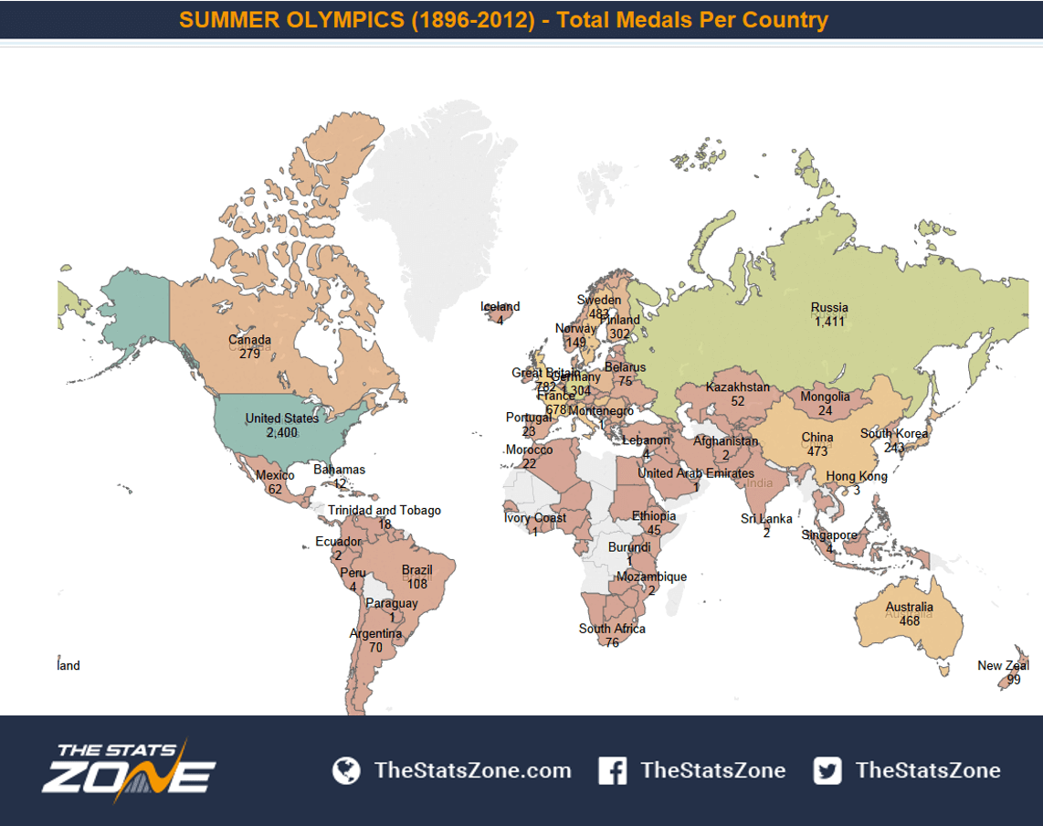
To get into the analysis, looking at the map below, we can see that USA comfortably has the most medals at 2,400, with a gap of almost 1,000 medals down to Russia in second place at 1,411. Both of these are huge nations with large populations to develop medal winning athletes. Therefore, it is interesting to note that from the graph we can also see that, despite their small population sizes, the Scandinavian countries (Denmark, Finland, Norway and Sweden) have an aggregated number of medals of 1,114 (Denmark 180, Finland 302, Norway 149 and Sweden 483). With this in mind. we move on to the next visualization to further investigate this.
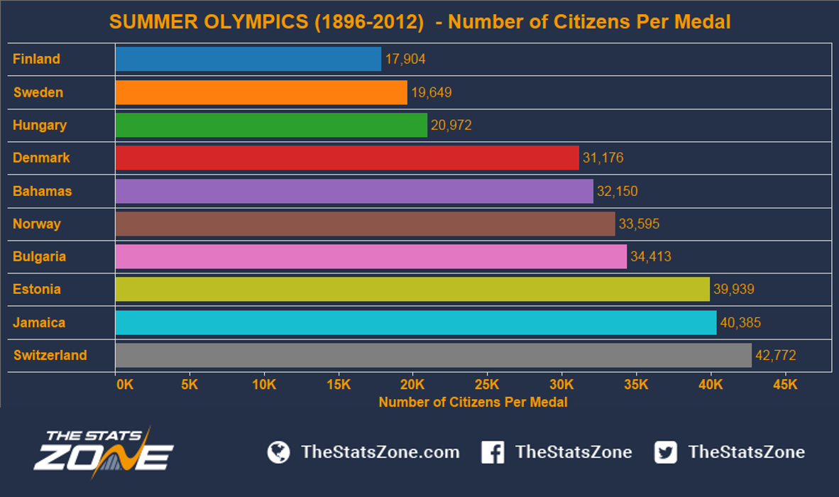
The graph below shows medals per capita. As expected, the Scandinavian countries by far outperform the rest of the field, with Finland leading this as they gain one medal for every 17,904 citizens, followed by Sweden at 19,649. Interestingly, Estonia also stands out in eighth place with one medal for every 39,939 citizens; it should be recognised that Estonia has a very strong historical link to Finland and Sweden. Two other strong countries are the Bahamas and Jamaica, both of which are notoriously famous for producing world class sprinters.
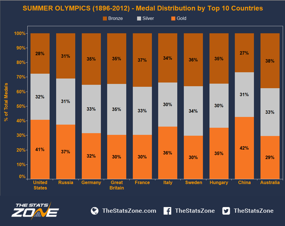
The last two graphs take into account all of the medals won per country. Since the medal ranking in the Olympic Games is based on number of Gold medals won, it’s interesting to investigate the proportional split between Gold, Silver and Bronze medals for the top 10 countries. Looking at the table below, we can see that USA and China hold the highest proportion of Gold medals in the field at 41% and 42% respectively. Australia also performs well in terms of medals won, even though they score the lowest proportion of gold medals out of the top 10 countries at 29%. Also notable is Sweden, who scored very well in terms of total medals per capita. However, we can see that Sweden follows the same pattern as Australia, with less than 1/3 of their medals being Gold. Before moving on, it’s worth pointing out that the proportion of silver medals is evenly distributed between all nations ranging between 30-35%.
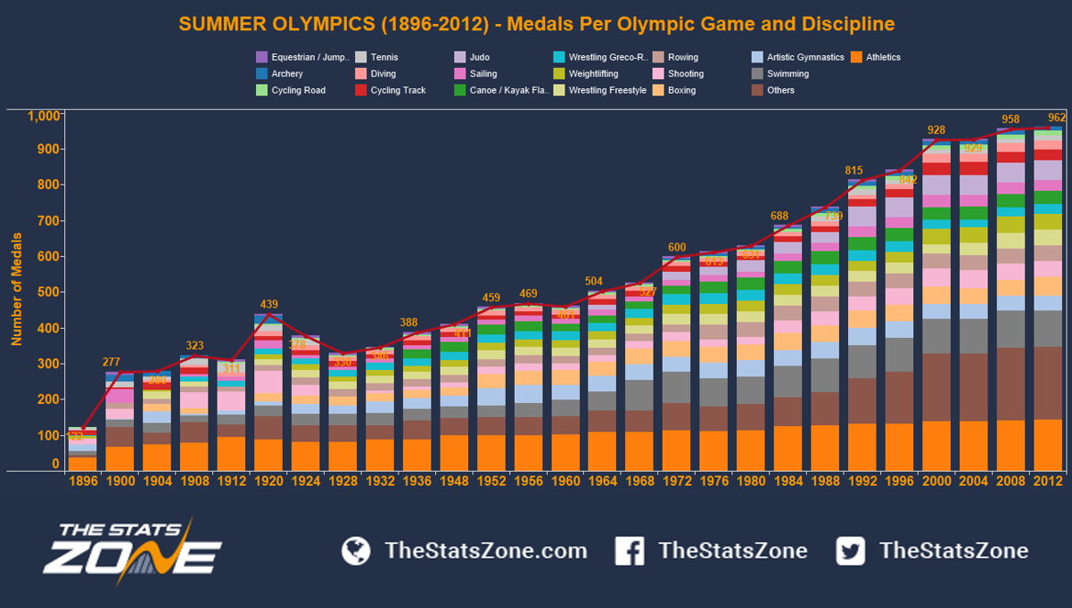
Having looked into country performance at the Olympics, it is also relevant to notice the year-on-year growth of the competition, which has been monumental since the start in 1896. Looking at the table below, we can see that the total number of medals in 1896 was 122, a huge difference when compared to the last (and largest) Olympics in London, where there were 962 medals awarded. A closer look at each specific discipline shows that Athletics, which traditionally dominated the competition, has seen very little change in terms of the number of medals awarded. We suggest that this is because athletics measures the most basic competition in human ability, and the discipline has not changed significantly since the first Olympic Games. Looking at Swimming, the second biggest sport, there was continuous growth until 1964, after which the number of medals stabilises. Also notable is Shooting, which was one of the only sports that saw a decrease in number of medals won from 1920, but since the 1970s has regained some ground. We haven’t been able to track down a specific reason for this, but one possible explanation could be that the First and Second World War would have had some impact on the decrease of shooting events. Most significantly, we can see that the driver behind the increased volume of medals awarded comes from the Other group, which confirms our previous statement that there has been a vast increase of sports added throughout the years.
To conclude, we have looked at the development and performance by countries in the Olympics since its modern era inception in 1896. USA is by far the strongest country in the field with an impressive proportion of Gold medals in their awards portfolio. If we drill down and take into account the population of each country, we learn that the Scandinavian peers outperform the rest of the field, with Finland and Sweden being particularly strong. As a final note we have seen that the Olympic Games has grown significantly in the period of the data set (roughly 100 years). The increasing addition of new sports to the international competition such as Golf, Rugby Sevens and Kite Surfing will keep adding to what is already the world’s biggest event.


